First post
Jocelyn Glei
What We Can Learn From Babies?
http://the99percent.com/articles/6695/what-we-can-learn-from-babies-experimentation-failure-creative-genius
In this article, the author discusses about what we can learn from babies. The author mentions that "The child who tries strange things and experiences lots of failure to get there is probably more creative." As we being matured, we start to care about how others are regard ourselves. We have the attitude where we do not want to look silly and we are afraid of failure. This type of attitude leads us to think inside the box where we stop to "explore", and be extremely sensitive. However, the key to achieve success is learning from failure. We should not give up after a failure because this makes us not creative and we start to repeat things instead of exploring other ways to achieve our goals. In other words, we stop exploring, in order to avoid failure. This makes us unsuccessful in the near future. Hence, what we can learn from babies is to be creative and adventurous rather than being depressed over our mistakes.
In my personal opinion, this piece stands close to my heart. I'm a type of person who does not like to be restricted by other things. However, I was not able to face failure as a kid. Like every other person's life, there are troubles in my life too and I like to be honest and admit that I make mistake and I cannot avoid every mistake I make. Mistakes and failures had a negative impact on me and blocked my way to attempt things which I never been touched. Even though I am curious for lots of things around me, I never attempt to touch them before someone else because I have the fear that it's not safe. Therefore, I'm the type of person who always been the follower and not the leader. When I work on my assignments and projects, I always drop a lots of new ideas because I was not sure if it would be acceptable to the audience or not. However, I realize that, as I put myself in the safe place to avoid failure, I lose the opportunity to be success. After reading this article, I realize that I probably missed lots of chance in the past time. Although I hate to be restricted, the fear which from my experiences already did that. In the future, I really should learn from babies to be creative and keep exploring unknown things, and ready to face the failure which is going to make me stronger in the future.
Jon Krasner
CH1 A Brief History of Motion Graphics
This is the first chapter for the text book "Motion Graphic Design". In this chapter, Krasner is talking about the history of motion graphics and how the animation reform during the time.
1. Precursors of Animation
-persistence of vision let us to perceive rapid flow of images as continous picture, which is the most basic principle of achieved animation.
-The illusion of motion was achieved until optical device and magic lantern emerged in Europe.
-William George Horner invented the zoetrop.
-The zoetrop was replaced by the praxinoscope which is invented by Emile Reynaud.
2. Early Cinematic Inventions
-star from research on the movement of horse to the study of human and animal various physical activities, in order to understand the movement.
-Louis and Auguste Lumiere developed the kinora.
-in 1894 cinematographe was invented. (the oldest film)
-later, the animation was developed very fast and founded the form of original animation.
3. Experimental Animation
-Norman McLaren experiment with drawing on the film.
-during the WWII, John Whitney builds analog computer which used for film titling.
-in 1974, the first time use computer graphic for animation.
4. Motion Graphics in Film Titles.
-Saul bass, a famous graphic designer who gave an enormous impetus to the motion graphics in film.
-here is a link about the advise of Saul bass to design student : http://www.youtube.com/watch?v=S7l0mIlzx_I
5. Motion Graphics in Television
-it is the modern digital animation techniques, that influence our daily life.
I'm interested in the the first part and fourth part of this chapter. Since I have been studied about the work of Saul Bass last term in multimedia 2H03 class. In addition the art techniques that mentioned in part one of this chapter, is familiar to me, because I learned this first year in Art history class. I always feel exciting when I found the connection between different couse wich I took.
CH2 Motion Graphics in Film and Television
This is the second chapter for the text book "Motion Graphic Design". In this chapter, Krasner is talking about the motion graphics in film and television, focus on film titles, network branding, commercials, public service announcements and music videos.
Film Titles
This part introduce and explain how the motion graphic been used and developed in film titles. Author just post some events and examples.
Since Saul Bass put motion graphic in film tiles, in 1950, more and more graphic designer put their work in film titles. Most of film titles that made by motion graphics got huge success, such as Around the Word in 80 Days, 007, Se7en, Mimic, Clockstoppers, The Number 23 and so on.
Networking Branding
-station identification: the practice of networks that identify themselves on air, typically by means of brand name. It always used as an announcer at the halfway point of the presentation of a television program.
-show openers: sets the stage for an upcoming program and helps promote a network’s identity
-show package: “video information system” that contains an assortment of designs that are used to promote a particular program.
-interstitial: the mini programs that appear between programs or other events. some are designed to highlight key issues, people or events, others function to promote a network’s brand. -bumpers: The transitions between programs and commercial breaks around 2 to 5 second -lower thirds: combinations of graphics and text that appear on the bottom portion of the screen. Always used in newscasts and some documentaries.
-mortises : full screen graphics, which used to frame live footage.
-lineups and up-fronts :lineup is a full screen graphic that informs viewers about a network's upcoming program schedule that display names, dates and times; up-fronts is a marketing piece that is designed to develop shows of advertisers of networks.
-tags: 3-4 second presentation that occur at the beginning or end of a spot, news open, or commercial. Always display a phone number or Web site address.
-network package: including every things that mentioned above.
-Promotional campaigns:the way to spread the public more aware of a brand,service and product.
Commercials
Motion graphics are related to commerce by develop the advertisements on television or film.
Music Video
Animation also used in music video, in ordet to enhance the video.
I really like this chapter, because it touch me a lot of stuffs which I wasn't knew. I found interesting in the relationship between animation and commerce. I want be working for the initiative advertisement in the future, so I thought most of contents that are talking in this chapter are extremely important to me to understand.
CH7 The Pictorial Composition
This is the seventh chapter for the text book "Motion Graphic Design". In this chapter, Krasner talks about the space and composition of motion graphics. Space and composition are very important concepts for graphic design.
Principle of composition
-unity: an underlying principle which refers to the coherence of the whole.
-balance: the form which suggests a sense of cohesiveness. It helps to create stability or instability for designer. (symmetrical balance--the division of a space into equally parts; radial balance--type of symmetrically balance that images are emitted from central focal point; crystallographic balance--contains numbers focal points that arranged into a repeating pattern.)
-figure and ground: figure is the subject that occupies the foreground space. Ground is the surface area of a composition.
-negative space: the space that is unoccupied or empty.(white space)
-size and scale: size relates to the format that elements are placed in; scale relative relationship that exist between elements.
-edge: define a compositions and play a role in establishing eye movement and hierarchy. It gives a sense of direction and degree that where the audiences should focus.
-direction: helps establish a compositions sense of purpose by providing a point of entry and exit for the viewer, and in complex compositions.
-contrast: It introduce variety into composition, clarify or simplify information, and intensify meaning, or refine the message being communicated. (scale, value, color, shape, surface, proximity, orientation.
-hierarchy: principle related to contrast, need for direction and scale.
-repetition and variety: repetition is the recurrence of one element in a composition. variety is always used together with repetition.
Constructing space
-juxtaposition and superimposition: two method of constructing space. juxtaposition is the placement of two or more elements that are related or unrelated. It will suggest a new meaning; superimposition is just overlaying one element on top of another elements. It also will suggest a new meaning.
-grids: a formal underlying structure that can serve as a guide to making purposeful design decisions regarding the placement, sizes, and proportions of elements in a composition to maintain a sense of organized unity.
-breaking spatial conventions: it is a special technique which able to give the audience a fantastic feeling. It does not limited by the normal space concept.
-mobile framing: changing the framing of a composition by simulating camera motion which gives audience a sense of mystery.
-3d space: a three dimensional way to display the animation. It has expanded boundaries, and looks same at in the real world.
I found interesting on "breaking spatial conventions". I think this technique is connect with the surrealism art, which is my favourite art style. It may give a huge impact to audiences's eyes and minds. In addition, I the technique of how to make the illusion of three-dimensions within a two-dimensional framework attracted me as well.
Second Post
Chapter 3 Motion Graphics in Interactive Media: an overview
The motion graphics can be incorporated into the interface of design which contribute to new design possibilities. This chapter talks about different definitions of the non-linear formats for Web animation and the effective design elements.
Java:
-produce interactive animations in Web page designs
-be able to run similarly on supported hardware or operating system
-requires programming knowledge
Animated GIFs:
-popular low-tech option
-all browsers support this format
-do not require plug-ins for viewing, no programming kills required
Flash:
-most effective interactive animation tool for delivering vector-based content
-full-screen playback on all monitor sizes and platforms
-able to scale vector images without any loss of resolutions
-hard to update and index by search engines
dHTML:
-recognized by most web browsers
-no requirements to download extra components
-limited in animation capabilities
-challenged to code that it should play consistently on all browsers
The Successful navigation design supports and directs users through the interface. The navigation system helps to build and put an emphasis on interactivity. The users can easily find information, and follow the hyperlinks. A good navigation design is the most important thing for web designs.
Other Elements:
-Motion in informational Kiosks: Public information facilities have become effective communication vehicles. They display the high resolution images and dynamic information.
-Motion in Multimeida: In education, computer-based training courses and reference books that allow user to access different informational format.
-Motion in DVD-Video: It can enhance the navigational process and add to the viewing experience.
Color Theory for Designers
Part 1: The Meaning of Color
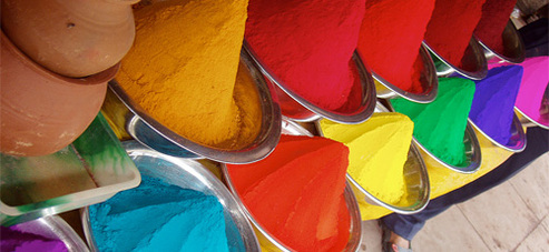
-Warm colors: Warm colors include red, orange, and yellow, and variations of those three colors. For instance, fire, of fall leaves, and of sunsets and sunrises, they are generally energizing, passionate, and positive.
-Cool colors: Cool colors include green, blue, and purple, which are more subdued than warm colors. For instance color of night, color water, color of nature, they are usually calming, relaxing.
-Neutral colors: Neutral colors always used as the background in design. For instance, black, white, gray, brown and so on. But they can also be used on their own in designs, and can create very complicated layouts. The meanings of neutral colors are much more affected than warm and cool colors.
-Meaning of color:
Part 2: Understanding Concepts And Terminology
-Hue: It is the most basic of color terms that denotes an object’s color. The hues people use in their designs convey important messages to their website’s visitors.
-Chroma: It refers to the purity of a color. For example, hue with high chroma has no black, white or gray in it. Adding white, black or gray reduces its chroma. Chroma can be thought of as the brightness of a color in comparison to white. It not good to use hues that have a very similar chroma in design.
-Value: It refers to how light or dark a color is. Ligher colors have higher values, darker color have lower values. Black has the lowest value of any hue, and white the highest.
-Tones: Tones are created when gray is added to a hue. Tones are usually softer-looking than the pure hues. Some times, it is much easier to use in the design.
-Shade: Shade is created when black is added to a hue, making it darker. The shade only applies to hues made darker by the addition of black.
-Tint: Tint is created when white is added to a hue, making it lighter. Very light tints are called pastels, but pure hues with white added to it is a tint.
-Part 3: Creating Your Own Color Palettes
-Traditional Color Scheme Types:
-Creating a Color Scheme: Shades, tones and tints are very important, and it will be better if adding in some neutrals. It is a good idea to using photo for color schemes. Five is a good number for the type of color that designer decide to use in his/her project.
-Warm colors: Warm colors include red, orange, and yellow, and variations of those three colors. For instance, fire, of fall leaves, and of sunsets and sunrises, they are generally energizing, passionate, and positive.
-Cool colors: Cool colors include green, blue, and purple, which are more subdued than warm colors. For instance color of night, color water, color of nature, they are usually calming, relaxing.
-Neutral colors: Neutral colors always used as the background in design. For instance, black, white, gray, brown and so on. But they can also be used on their own in designs, and can create very complicated layouts. The meanings of neutral colors are much more affected than warm and cool colors.
-Meaning of color:
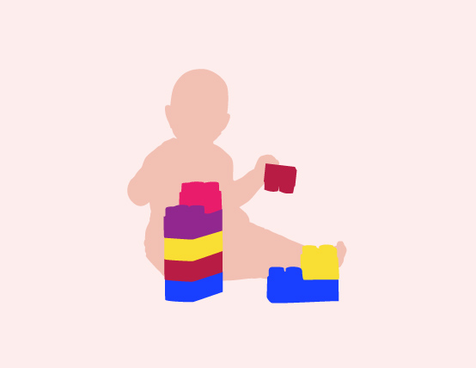
- Red: Passion, Love, Anger
- Orange: Energy, Happiness, Vitality
- Yellow: Happiness, Hope, Deceit
- Green: New Beginnings, Abundance, Nature
- Blue: Calm, Responsible, Sadness
- Purple: Creativity, Royalty, Wealth
- Black: Mystery, Elegance, Evil
- Gray: Moody, Conservative, Formality
- White: Purity, Cleanliness, Virtue
- Brown: Nature, Wholesomeness, Dependability
- Tan or Beige: Conservative, Piety, Dull
- Cream or Ivory: Calm, Elegant, Purity
Part 2: Understanding Concepts And Terminology
-Hue: It is the most basic of color terms that denotes an object’s color. The hues people use in their designs convey important messages to their website’s visitors.
-Chroma: It refers to the purity of a color. For example, hue with high chroma has no black, white or gray in it. Adding white, black or gray reduces its chroma. Chroma can be thought of as the brightness of a color in comparison to white. It not good to use hues that have a very similar chroma in design.
-Value: It refers to how light or dark a color is. Ligher colors have higher values, darker color have lower values. Black has the lowest value of any hue, and white the highest.
-Tones: Tones are created when gray is added to a hue. Tones are usually softer-looking than the pure hues. Some times, it is much easier to use in the design.
-Shade: Shade is created when black is added to a hue, making it darker. The shade only applies to hues made darker by the addition of black.
-Tint: Tint is created when white is added to a hue, making it lighter. Very light tints are called pastels, but pure hues with white added to it is a tint.
-Part 3: Creating Your Own Color Palettes
-Traditional Color Scheme Types:
- Monochromatic color schemes are made up of different tones, shades and tints within a specific hue.
- Analogous color schemes are the next easiest to create.
- Complementary schemes are created by combining colors from opposite sides of the color wheel.
- Split complementary schemes are almost as easy as the complementary scheme.
- Tetradic (double) color schemes are probably the most difficult schemes to pull off effectively.
- Custom color schemes are the hardest to create. Instead of following the predefined color schemes discussed above, a custom scheme isn’t based on any formal rules.
-Creating a Color Scheme: Shades, tones and tints are very important, and it will be better if adding in some neutrals. It is a good idea to using photo for color schemes. Five is a good number for the type of color that designer decide to use in his/her project.